Originally posted 4 July 2016.
The WordPress plugin repository is being worked on.
A “beta” version is up right now at:
https://wordpress.org/plugins-wp/
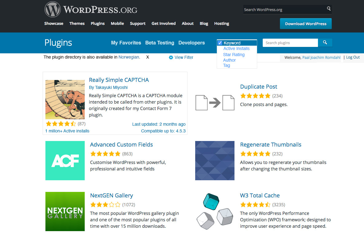
The following screenshot shows the WordPress plugin repository while making a search for featured.

What is missing from the above is a filtering approach to searching for plugins. Here is one suggestion.

In addition to items from my first wireframe I included the Make Favorite red heart and text. (I have it already Favorited.)
I moved the title and author name above the plugin banner and removed the extra thumbnail banner.
I made the wide plugin banner smaller.
Added the column to the right of the banner.
Made the description area as wide as the banner. What is most important in viewing a plugin screen is the information sections.
Brought back in tabs which gives a good overview of what information is available.
I changed the search drop down colors from white to blue (just as a test).
Before searching for plugins or in the individual plugin screen one could open a View filter to activate additional filters in the search field.
One can also open a View Filter setting.

WordPress backend Installed plugins screen
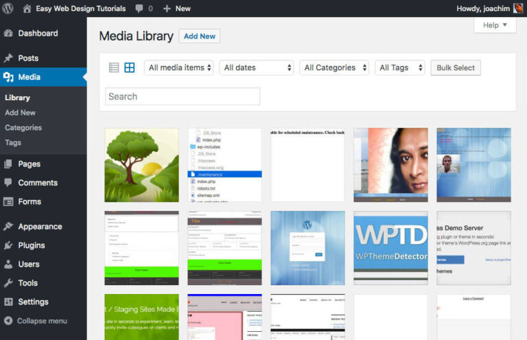
Add a dash of filtering. Inspiration from the Media Library.

I changed the bar under the Plugins title.
Viewable by text/description or by smaller thumbnails or simpler methods. Similar to what can be done in the Media Library.
Added information into a drop down.
Added a search drop down box that will search installed and new plugins.
I made these mockups to show an alternative that I believe will be a better option for most users.
Having a good search and defining the viewing plugin experience is very important. As is the overview such as tabs or similar to create a clear distinction between the information that is available on each single plugin screen.
I am hoping my mockups can inspire and improve the existing “beta” version located at https://wordpress.org/plugins-wp/
There was also an article written at: wptavern.com/community-created-mockups-suggest-improvements-to-the-wordpress-plugin-directory-redesign