Sometimes we want an area of the page to be fixed or stick to the page.
Sections:
A sticky top Navigation menu.
A sticky header.
Adding a sticky Navigation menu.
An example using the default theme Twenty Twenty One is using jump HTML anchor links where one clicks a link and it jumps to a section further down on the same page. We might want to show the top menu also further down on the same page.
- Add a Navigation block to your page/post.
- Add custom internal HTML anchor links. I called these #section1, #section2 and #section3.
- Add receiving anchor links further down on the page through the sidebar settings > Advanced > HTML anchor. I called these section1, section2 and section3 (the same as the above). I added the anchor links to 3 Cover blocks.
- Add the needed CSS for the nav menu to stick.
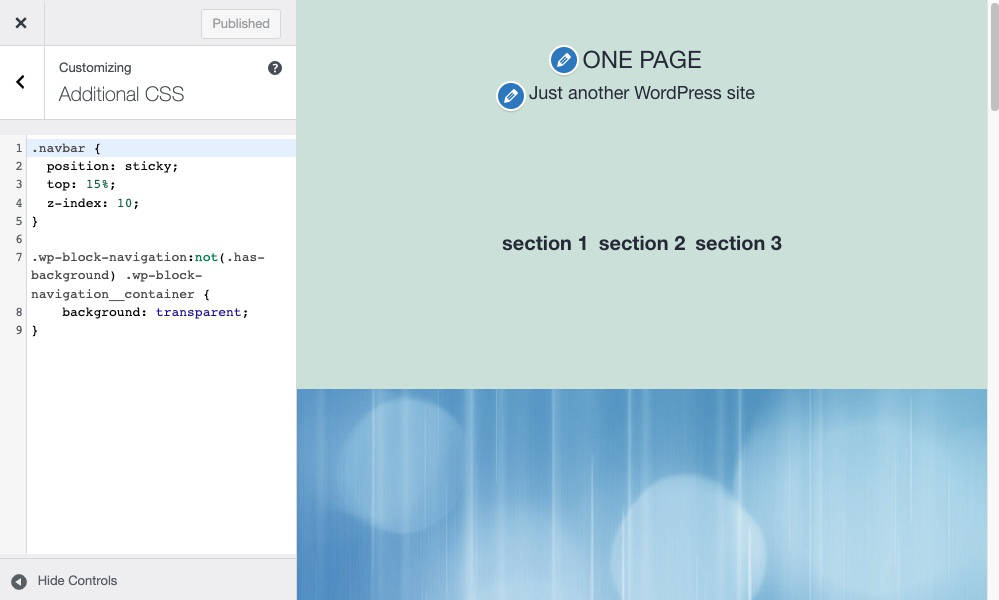
In the theme Twenty Twenty One I had to also remove the background color. If you want a background color then do not add the background: transparent code.
Here is the code I used.
/* navbar class is added to the Nav block sidebar settings Advanced CSS area. */
.navbar {
  position: sticky;
  top: 15%;
  z-index: 10;
}

/* Removed the background color for the Twenty Twenty One theme. */
.wp-block-navigation:not(.has-background) .wp-block-navigation__container {
    background: transparent;
}
Here is the video walk through.
Adding the full header as a sticky.
Using the default theme Twenty Twenty One. Try out this code with other themes as well.
- Go to the frontend of the site.
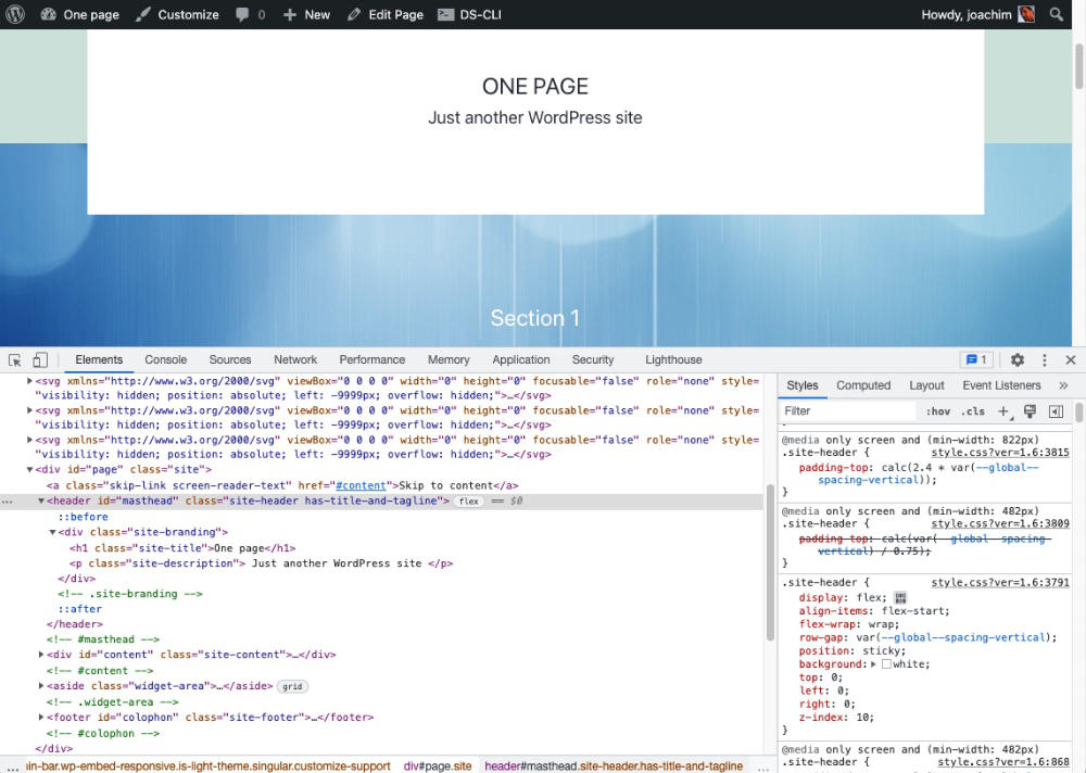
- Right click the header area and select “Inspect”. Check the HTML (left) and click the id masthead.
- Look for .site-header CSS (right).
- Add the following code into the .site-header. Here is the full code. Default code and what I added.
.site-header {
    display: flex;
    align-items: flex-start;
    flex-wrap: wrap;
    row-gap: var(--global--spacing-vertical);
    /* The below code is new. Change position to fixed and notice the difference. */
    position: sticky;
    background: white;
    top: 0;
    left: 0;
    right: 0;
    z-index: 10;
}
A screenshot showing the HTML area (left) and the CSS area (right). On the left side I found masthead and clicked it. On the right I found the .site-header CSS class and added code to create a sticky. I added a white background just to make it more obvious that it is a sticky. Each theme will need some nudging to get the effect you are looking for. NB! Refreshing the page will remove any modifications through the Inspect area. Add the code to the customizer, a child theme style.css or a custom plugin.
Resources used.
Position: fixed vs position: sticky.
Fixed.Fixed to a page is more rigid. One will need to define top, left and right positions as it also changes the default location.
Sticky. Sticks to the page where it is located and will stay in the same spot further down on the page. I mix the meaning of both. This link to the blog post by Kevin Powell explains it further.
https://www.kevinpowell.co/article/positition-fixed-vs-sticky/
Here is a Gutenberg issue for adding an option to the Header (and Navigation block) to stick the header/nav to the page. Fixed Position Header and Footer Template Parts


