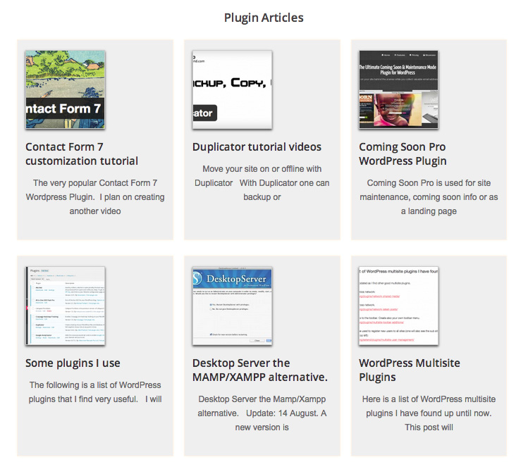
The result showing the Plugin Articles section.
Adding widgets code to the child theme functions file.
One can just add one home widget area and add the Genesis – Featured Posts widget multiple times for different section, but just in case I want to change things around I decided to add a few more widget areas.
In your Child theme functions.php file add the following:
//* Register widget areas
 genesis_register_sidebar( array(
    'id' => 'home-top',
    'name' => __( 'Home - Top', 'metro' ),
    'description' => __( 'This is the top section of the homepage.', 'metro' ),
 ) );
 genesis_register_sidebar( array(
    'id' => 'home-middle-left',
    'name' => __( 'Home - Middle Left', 'metro' ),
    'description' => __( 'This is the middle left section of the homepage.', 'metro' ),
 ) );
 genesis_register_sidebar( array(
    'id' => 'home-middle-right',
    'name' => __( 'Home - Middle Right', 'metro' ),
    'description' => __( 'This is the middle right section of the homepage.', 'metro' ),
 ) );
 genesis_register_sidebar( array(
    'id' => 'home-bottom',
    'name' => __( 'Home - Bottom', 'metro' ),
    'description' => __( 'This is the bottom section of the homepage.', 'metro' ),
 ) );
The above code:
The id is used to style with CSS the specific widget (which we will see in a moment).
The name and description is seen in the backend widgets area. Where it says metro is a leftover from the StudioPress Metro Child theme which was my I starting point for the theme I am creating. The metro name can be changed or deleted. Go to the backend -> Appearance -> Widgets and the new widgets should be in place.
Styling the new home widgets.
In your style.css file add the following and change to fit your needs. These are the home widgets to choose from to style:
.home-top
.home-middle (.home-middle-left and .home-middle-right)
.home-bottom
.home-top {
      /* background: url(../img/lines.png) top repeat-x;
      border: 1px solid #ccc; */
      background-size: 8px 8px;
      margin-bottom: 48px;
      padding: 22px 7px 19px 7px;
 }

/* .home-middle widget sections are not at present in use as I am only using home-bottom for all the layout*/
.home-middle {
   overflow: hidden;
 }

.home-middle-left,
.home-middle-right {
      width: 200px;
      /* background: url(../img/lines.png) top repeat-x;
      border: 1px solid #ccc; */
      background-size: 8px 8px;
      margin-bottom: 48px;
      padding: 22px 7px 19px 7px;
}

.home-middle-middle {
      width: 30%;
      /* background: url(../img/lines.png) top repeat-x;
      border: 1px solid #ccc; */
      background-size: 8px 8px;
      margin: 0 15px 48px 15px;
      padding: 22px 7px 19px 7px;
}

.home-middle-left {
      float: left;
 }

.home-middle-middle {
      float: left;
 }

.home-middle-right {
      float: right;
 }

.home-bottom .featured-content .widget-title {
      margin: 20px auto;
      font: bold 1.4em 'Open Sans', sans-serif, 'Bevan', ariel;
      color: #544d4d;
 }

.home-bottom {
      /*background: url(../img/lines.png) top repeat-x;
      border: 1px solid #ccc;*/
      background-size: 8px 8px;
      margin-bottom: 48px;
      padding: 22px 7px 19px 7px;
 }


/* I use the home-bottom area in the home page layout. */

/* Title of each category group */
 .home-bottom .widget-title {
    font: bold 22px 'Open Sans', sans-serif;
    margin: 25px 0 10px 0;
 /* border-bottom: 1px solid #ccc; */
 }

.home-bottom {
    margin-bottom: 48px;
    padding: 22px 7px 19px 7px;
 }

/* Each post column */
 .home .post {
    display: inline-block; /* It is actually very important to use the display tag either with block, box etc */
    float: left;
    width: 31%;
    height: 380px;
    padding: 2% 1.5% 1% 1.5%;
    margin: 0 10px 30px 10px;
    border: 2px solid #fef3e6;
   -moz-box-shadow: 0 0 1px #fffaea;
    box-shadow: 0 0 3px #fffaea;
    background-color: #efefef;

/* Thumbnail image */
.post-image {
width: 260px;
height: 180px;
}

/* Affects the More Posts from this Category link text */
.widget ul > li:last-child, .widget p:last-child {
margin-bottom: 50px;
clear: both;
}

/* Center the text below the sections that links to additional articles */
.more-from-category {
text-align: center;
}
Adding the Genesis – Featured Posts Widget
To do so I begin by going to Appearance -> Widgets.
I drag the Genesis Featured Posts Widget into one of the Home widget areas (I decided to use the Home Bottom location).
Filling out the Genesis – Featured Posts Widget information.
Gave the widget a name: Plugin Articles
Number of Posts to show: 9
Order by: Comment Count. I might change this to by date.
Clicked the checkbox for Show Featured Image. Selected the thumbnail. Alignment does not matter as I will style how it looks through the CSS.
Clicked Show Post Title.
Content Type: Show Content Limit. I decided on 90.
Clicked Show Category Archive Link and added the text Additional Plugin articles.
Clicked Save and checked my front page.
I then added another Featured Posts widget for my Developer, Themes and How to Categories.
Some additional styling of the front page
In my CSS file I added the following code adapted from
WPsites.com – Genesis Grid Column Archives/Category pages tutorial
/* Each post column */
.home .post {
     display: inline-block;
     float: left;
     width: 31%;
     height: 380px;
     padding: 2% 1.5% 1% 1.5%;
     margin: 0 10px 30px 10px;
     border: 2px solid #fef3e6;
     -moz-box-shadow: 0 0 1px #fffaea;
     box-shadow: 0 0 3px #fffaea;
     background-color: #efefef;
}

/* Thumbnail image */
.post-image {
     width: 260px;
     height: 180px;
}

/* Affects the More Posts from this Category link text */
.widget ul > li:last-child, .widget p:last-child {
     margin-bottom: 50px;
     clear: both;
}

/* Center the text below the sections that links to additional articles*/
.more-from-category {
   text-align: center;
}

/* Title of each category group */
.home-bottom .widget-title {
   font: bold 22px 'Open Sans', sans-serif;
   margin: 25px 0 10px 0;
   /* border-bottom: 1px solid #ccc; */
}

.home-bottom {
   margin-bottom: 48px;
   padding: 22px 7px 19px 7px;
}

/* Each post column */
.home .post {
   display: inline-block;
   float: left;
   width: 31%;
   height: 380px;
   padding: 2% 1.5% 1% 1.5%;
   margin: 0 10px 30px 10px;
   border: 2px solid #fef3e6;
   -moz-box-shadow: 0 0 1px #fffaea;
   box-shadow: 0 0 3px #fffaea;
   background-color: #efefef;
}

/* Thumbnail image */
.post-image {
   width: 260px;
   height: 180px;
}

/* Affects the More Posts from this Category link text */
.widget ul > li:last-child, .widget p:last-child {
   margin-bottom: 50px;
   clear: both;
}

/* Center the text below the sections that links to additional articles */
.more-from-category {
  text-align: center;
}
Remember to also modify the media queries at the bottom of the CSS stylesheet.
Here are some of the CSS I added to the existing media queries in the stylesheet for this site:
@media only screen and (max-width: 1139px) {
.content {
   width: 99%;
 }

 .full-width-content .content {
   width: 99%;
   padding: 0;
   float: left;
 }
}


@media only screen and (max-width: 1023px) {

 .nav-primary {
    height: 45px;
 }

 .nav-primary ul a,
 .nav-primary current_page_item ul a,
 .nav-primary current_page_item a,
 .nav-primary current-menu-item ul a,
 .nav-primary current-menu-item a,
 .nav-primary li:hover > ul a {
    padding: 6px 1px 6px 9px;
    width: 100px;
 }

 .home .post {
    margin: 0 5px 30px 5px;
 }

}

@media only screen and (max-width: 767px) {

 .nav-primary {
    height: 75px;
 }

 .genesis-nav-menu {
    text-align: left;
    font-size: 13px;
 }

 /* Each post column */
 .home .post {
    width: 47%;
    padding: 2px;
    margin: 4px;
 }

 .site-container {
    padding: 5px;
 }

}

@media only screen and (max-width: 480px) {

 /* Each post column */
 .home .post {
 width: 100%;
 float: left;
 height: auto;
 }

}
Your own media queries modifications will naturally be different then what I posted above.
Resources:
https://wpsites.net/web-design/archive-page-grid-style-columns-using-css/
https://www.carriedils.com/add-widget-area-below-nav/
https://amethystwebsitedesign.com/genesis-featured-posts-widget-for-recent-posts-with-images/
