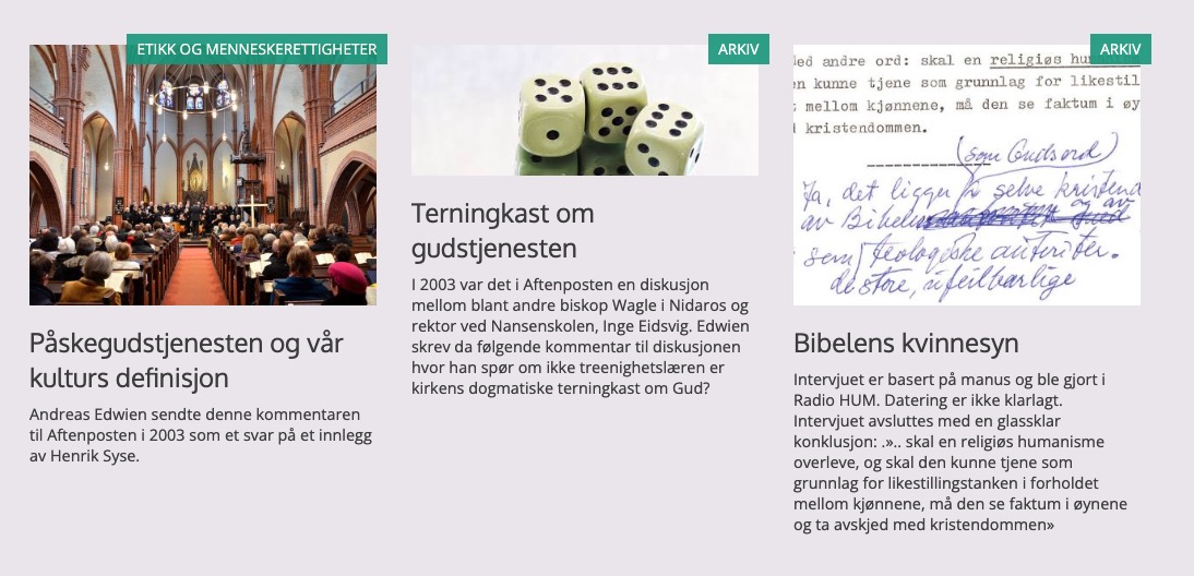
In the Query Loop I replaced the Featured Image block with a Cover block and added Category blocks on top of the Cover. Making Category button labels. I also added a fallback featured image.
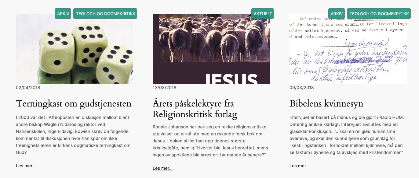
I have renewed a 8 year old web site called edwien.no (articles relating to various aspects of religion). I decided to use the default theme Twenty Twenty Four and the Site Editor. The various blog archive pages look like what you see below. There are green category buttons over the right top corner edge of the featured images. I needed to figure out how to accomplish the same in the Site Editor (Full Site Editing). Which meant I had to hand code the green buttons to link to the category (or categories) the post is associated with.
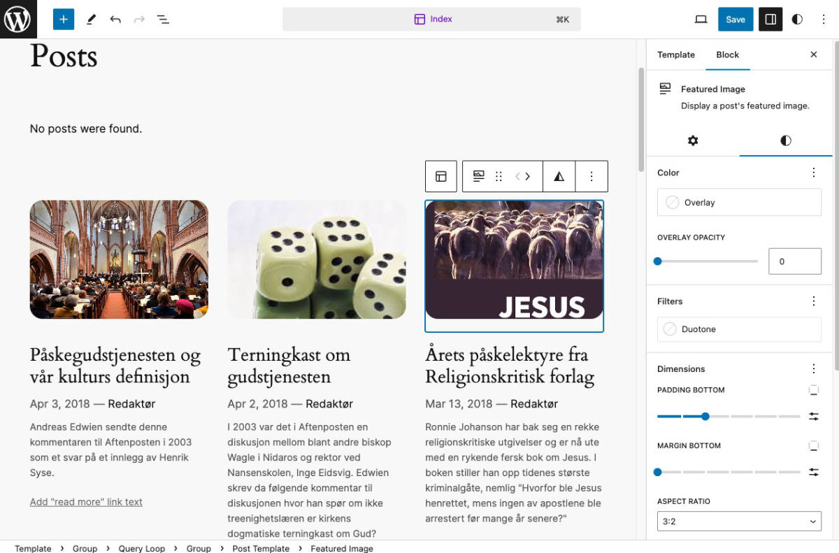
Going to a default Index or Blog home page in the Site Editor. One can select from various Blog styles. Then click the image (Featured Image) One can change the Aspect Ratio to something that looks better.
A video walk through of adding a category block on top of the Cover block,
Adjusting the Post Template inside the Query Loop
- Be sure the Post Template block is selected.
Look at the Breadcrumbs in the bottom or use the List View in the top area of the Template. - Click the black + icon and add a Cover block.
- Set the Cover block to use the Featured Image. This will then automatically show the featured image of each post.
- Inside the Cover block add a Category block. In the Cover block toolbar change Content position to top right.
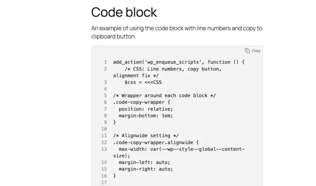
Adding the CSS code
After the above steps are done the following code needs to be added. I did a lot of searching and exploration and found a good working code.
One code for the Cover block to adjust the placement of the buttons and the other for the Category block to create the buttons.
I use a plugin called Code Snippet premium to add CSS but it is also possible to add CSS through the Appearance -> Editor -> Styles -> Click the Pencil to the right of the Styles heading (in the black sidebar area) -> See the right Styles settings area and click the 3 dots in a vertical row beside the styles settings heading. Select Additional CSS. A huge blank area opens up. Here one can add CSS similar to the old method of adding CSS through the Additional CSS area inside the customizer. Find your preferred way to add CSS.
Cover block CSS
In the blog Home / Index etc template. Select the Cover block. In the settings area click Advanced. In the Additional CSS class(es) add a class name. I added the name cover-categories.
Add the following CSS to the area you want to add CSS code to. I added it to the Code Snippet plugin.
/* Cover block */
.cover-categories {
	position: relative;
	overflow: visible;
       /* Added a fall back image for a missing featured image. */
      background: lightblue url("https://ecweb.no/wp-content/uploads/2024/01/bilde-av-andreas-edwien.jpg") no-repeat fixed center;
}
The above CSS contains code which tells it that what is inside can overflow. I also added a fall back featured image for when there is no featured image.
Category block CSS
In the blog Home / Index etc template. Select the Category block inside the Cover block. In the settings area click Advanced. In the Additional CSS class(es) add a class name. I added the name is-style-category.
Add the following CSS and explore the code.
/* Category block */
.is-style-category {
    position: absolute;
    top: -20px; /* Moves the Category buttons up. */
    right: -13px; /* Moves the Category buttons to the right. */
}

/* Category block button */
.is-style-category a {
    display: inline-block;
    background: #16A085;
    opacity: 0.9;
    color: white;
    border: 1px solid #786C6C;
    font-size: unset!important; /* Not sure if this is needed but it was a part of the original code. */
    margin-right: 0;
    text-decoration: none!important;
    border-radius: 5px;
    text-transform: uppercase;

    padding: 7px 5px 5px 7px;
   /* margin: -10px -5px 1px 1px;
    line-height: 14px; */

}

/* Category block button on hover */
.is-style-category a:hover {
    background: #16A085;
    opacity: 1;
    color: white;
}
The final result should look like this. It is pretty similar to the old edwien.no web site. The new web site will overwrite the old web site when it goes live.
