One good way to find the correct CSS tag is to use the browser inspect properties.
Find a section on the frontend of your site you want to take a closer look at
and then right click and select Inspect.
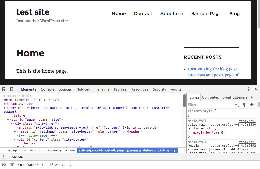
HTML area to the left and CSS to the right. We see body class such as home, page, page-id46, page-template-default, logged-in etc.
I use the /* comment */ in the below code as that signals that there is a text comment and will not be read by the browser. It is useful to add comments to code, as one can go back and look at the code and also read the comment making the code more understandable.
!important
Sometimes if the code does not work then one needs to use the !important tag, as there might be similar code affecting the site. Adding important will be read before the other code.
.home
/* .home only adjusts the home page and no other pages. Here is an example of
adjusting the .site-header in the home page. If I wanted to adjust the
site header for all the pages/posts I would remove .home and just use .site-header. */

.home .site-header {
background: #cfc6c6;
box-shadow: 0px 3px 5px #444;
border-radius: 5px;
margin: 5px 5px 10px 5px;
padding: 12px;
}
.page
/* Adjusts the #main (div) in all the pages.  */

 .page #main {
 background: #a55555;
 padding: 12px;
 box-shadow: 0px 3px 5px #444;
 }
.page-id
/* Another way to only adjust a page is to use the
page id then add the area one wants to adjust. */

 .page-id-46 #main {
 background: #a55555;
 padding: 12px;
 box-shadow: 0px 3px 5px #444;
 }
.post
/* Adjusts the #main (div) all the posts  */

 .post #main {
 background: #a55555;
 padding: 12px;
 box-shadow: 0px 3px 5px #444;
 }
.post-36
/* Adjusting one single post with the ID of 36 */

 .post-36 {
     background: yellow;
 }
.single or .single-post
/* .single or .single-post affect all single post pages. */

 .single {
    background: green;
 }
.blog
/* .blog affects only the main blog page. */

 .blog {
    background: orange;
 }
.archive
/* .archive affects all category pages.
Look for the CSS to for instance only affect the post
or a specific category. It could be
.article .post .category-nameofcategory etc. */

.archive .article {
    border: 2px strong #ccc;
    padding: 5px;
    box-shadow: 0px 3px 5px #444;
    background: #ccc;
}
body
/* The body tag is unique that it does not use a dot before its name. */

body {
  background: green; /* Use color name or hex code */
  background-color: #00ff00; /* Green hex xode. */
  background-color: rgba(0, 255, 0.3) /* Use rgba to create a transparency. */
}
An RGBA color value is specified with: rgba(red, green, blue, alpha). The alpha parameter is a number between 0.0 (fully transparent) and 1.0 (fully opaque). See https://www.w3schools.com/cssref/css_colors_legal.asp for more information.
Making a change to multiple pages.
/* Adjusting the body tag using page id numbers.
This example adjusts two pages. The home and contact pages.
Notice the comma between each tag that I use. */

 body.page-id-46,    /* Home page uses the page ID. */
 body.home           /* Home page uses the name home. */
 body.page-id-59     /* Uses the ID for the Contact page */ {
     background-color: #151dfa;
 }
.page-id-6 #header,
.page-id-10 #header,
.page-id-24 #header {
height: 190px;
margin-top: -50px;
background: #ccc; /* sand color - other color #fcfcfc white */
border-radius: 0.8em;
-webkit-border-radius: 0.8em;
-moz-border-radius: 0.8em;
}body:not(.home)
/* All other pages except home has a white background in main and footer. */

body:not(.home) #main,
body:not(.home) .gridd-tp-footer {
   background: #fff;
}
Affecting a div within another div.
NB! It can be somewhat tricky affecting a div within another div. Here is an example of something I have worked on earlier. I want to affect a class inside the footer. There is a class above used multiple places. Here is an example:
.level1.level1anotherclass .level2 = Level 1 is to affect level 2. One adds the various that is to be affected classes .level1a.level1b.level1c and then the .level2. Real example:
/* The uk-container.uk-container-center affects only
the .tm-sub-footer. Not anywhere else on the site.*/

.uk-container.uk-container-center.tm-sub-footer {
     background: rebeccapurple;
     margin: 0 !important;
     max-width: 100%;
     padding: 10px 8px 1px 6px;
}
/* Just affect the post titles below the posts. */
h2.post-title {
color: red;
}Hide page title inside a H1 tag.
.home h1.entry-title {
    display: none !important;
}
H2 inside a header.
.header h2 {
   color: blue;
   font-size: 26px;
}
Remember to use Inspect (element) by right clicking the area you want to affect on the frontend, and find the html and CSS that you want to affect.
Here is a video showing how I used Inspect to figure out some CSS adjustments to a site I was working on.
Affecting the navigation menus.
/* Adding underline to the menu links. */

 #site-navigation a {
     text-decoration: underline;
 }
/* Underline anything that is a link.
Title, site description and the site navigation inside the header. */
.site-header-main {
text-decoration: underline;
}/* Remove underline of the Home page menu link. */
.page-id-46 #menu-item-69 a {
text-decoration: none;
}Background fixed image.
Adding CSS making the background image stay fixed while content is scrolled on top.
/* Inside content on the home page. */

.home .content {
 background: #000 url('images/Blue-bubbles.jpg');
 background-repeat: no-repeat;
 background-attachment: fixed;
 background-size: cover;
 background-position:center center;
 position: relative;
}
background. #000 black color and contains the url to image used.
background-repeat. Options are inherit, no-repeat, repeat, repeat-x, repeat-y, round and space.
background-attachment. Options are fixed, inherit, local or scroll.
background-size. Options are auto, contain or cover.
background-position. Options are bottom, calc, center, inherit, left, right or top.
position. Options are absolute, fixed, inherit, relative or static.
Html and Inline CSS
When you use html in your php files you can also add some CSS inline such as:
<div class=”getting-started” style=”height: 670px; padding: 5px;text-align: center;”>

or just add the code to your external CSS stylesheet.

.getting-started {
 height: 670px;
 padding: 5px;
 text-align: center;
 }
Another example on using CSS inside a php file.
echo '<style type="text/css">
 #totop {
 position: fixed;
 right: 30px;
 bottom: 30px;
 display: none;
 outline: none;
 text-decoration: none;
 font-size: 32px;
 }
 #totop:hover:after{
 color: blue;
 text-decoration: underline;
 font-size: 16px;
 }
 </style>';
Here are some examples of Divs that might be inside the theme that you use. Open the Developer Tools. By right clicking the frontend page/post you want to target and select Inspect. Notice the HTML and CSS areas that show the code.
body – full background area of the page. NB! Remember that the body tags has another structure. Example: body.page-id-8.
#header – Inside header area where the banner/logo and main menu are.
#site-logo – Use this div tag and replace your logo.
#headerwrap – Area behind the header (Stretches across the screen left to right).
#body – Area outside of the content area (Stretches across the screen left to right).
#layout – Content and sidebar area.
#content – Inside the content area.
#sidebar – Inside the sidebar area.
#footer – Inside the footer area.
#footerwrap – Area behind the footer (Stretches across the screen left to right).
Adding a new class to your html link or image.
/* There are different ways to add a new class. */
<a href=”to-a-page.com” target=”_blank”
rel=”nofollow” title=”page title” class=”add-class”> Link name </a>
target=”_blank” opens a new tab in the browser.
rel=”nofollow” the link is not tracked by google.
title=”page title” the title that can be seen when hovering over the link.
class=”add-class” adds a new class that can then be styled in your CSS stylesheet (probably style.css or another CSS file).
<img src=”../images/facebook-icon.png” alt=”an
alternative image name” width=”45″ border=”1″ class=”fb”>
img src Image source. The Facebook icon is located inside the folder images. The images folder is located inside a higher folder unspecified by the ..
alt is the alternative name that shows up if the image is not seen. It is important for screen readers and for SEO.
width (and height) tells the browser how wide the image is to be.
border puts a border around the image.
class=”fb” adds a new class that can be styled in the stylesheet.
To create an image link:
<a href=”to-a-page.com” target=”_blank” title=”page title”>
<img src=”../images/facebook-icon.png” alt=”an alternative image name” width=”45″> </a>
https://www.w3schools.com/tags/tryit.asp?filename=tryhtml_image_link
HTML Anchor tags
Anchor tags makes it possible to create an inline link that jumps from one area of the page to another area on the same or another page.
To try it out. Go to the top and click the anchor link and you will see that it goes down to this area of the page.
- Create a link. Example:
On the same page:
<a href=”#anchor-tags”>anchor tags</a>

On another page:
<a href=”https://yourwebsitename.com/html-tips/#anchor-tags”>
Get more information about anchor tags on my html tips page.</a>
2. Add the receiving id to where the link ends up at.
<p id=”anchor-tags”>HTML Anchor tags</p>
(I added this link just above the HTML Anchor tags title.
To give it some space. So one can see the title.)

<h2 id=”anchor-tags”>HTML Anchor tags</h2>
(Here is an example of adding it around the title.)
wendycholbi.com/anchor-links-jump-links
See my Gutenberg anchor/jump point tutorial.
Adding effects to images.
img.wp-image-24 {
 border: 5px solid #333;
 filter: grayscale(100%);
 transition: all .3s ease-in-out;
}

img.wp-image-24:hover {
 filter: none;
 border: 5px solid #fd0202;
 transform: scale(1.2);
}

/* Adding the effect to all the images. */
img {
  border: 5px solid #333;
  filter: grayscale(100%);
  transition: all .3s ease-in-out;
}
Opacity
/* Opacity of 0 is full opacity. Opacity of 1 is no opacity. */
.header {
   background-color: #00B2EE;
   opacity: 0.9
}

/* Using rgba. */
.header {
    background-color: rgba(0,178,238, .9);
}
Hex color to RGBA converter: https://www.hexrgba.com/
Before and after
/* Do something before item is clicked. Menu item. */
.current-menu-item:before {
    content: "";
    display: block;
    background: #0C4DA2;
    width: 100%;
    height: 10px;
    position: absolute;
    top: -5px;
}

/* Do something after the menu item is clicked. */
.current-menu-item:after {
    content: "";
    display: block;
    background: #0C4DA2;
    width: 100%;
    height: 10px;
    position: absolute;
    bottom: -5px;
}
Media queries
Drag the browser window larger and smaller and notice how the layout changes. This is media queries.
I added a background color to each break point below so that I could see where it changed. I then adjusted the width so the layout changed at the right size. I would then also add new media queries where it was needed.
@media only screen and (max-width: 1250px) {
    .fa {
      padding: 4px;
      margin: -10px 10px 0 -2px;
      background: red;
    }

}


@media only screen and (max-width: 1150px) {
    .fa {
      padding: 3px;
      margin: -10px 10px 0 -7px;
      background: green;
    }

}

@media only screen and (max-width: 510px) {
    .fa {
       padding: 1px;
       margin: -10px 10px 0 -11px;
       background: blue;
    }

}
I will remove the background colors when the layout looks good at the various max width sizes. Media queries are most often added to the bottom of the style.css file. Or you can also add it through the customize -> Additional CSS section.
Resources:
https://mobiletest.me/
http://www.infobyip.com/testwebsiteresolution.php?
https://www.w3schools.com/css/css_rwd_mediaqueries.asp
https://www.emailonacid.com/blog/article/email-development/emailology_media_queries_demystified_min-width_and_max-width/
Animations
Using Transitions to create an animated effect.
https://www.w3schools.com/css/css3_transitions.asp

